Does Your Estimate Accurately Reflect the Five Dimensions of Software Trade-offs?
A recent series of posts by Karl Wiegers eloquently discusses the "reality of tradeoffs" software professionals deal with every day, going beyond the typical success drivers (time, cost, and quality) to include product features and staff. He shares inspiring practical information by making distinctions between constraints, drivers, and degrees of freedom, each representing the amount of flexibility the project manager has to adjust a key factor.
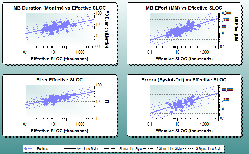
SLIM-Estimate has modeled the non-linear interdependencies of these metrics for over thirty years. It accounts for Wiegers’s five project success factors explicitly, showing the tradeoffs between them in real time. I have mapped Wiegers’s Five Dimensions to SLIM-Estimate’s parameters to show how you can use SLIM-Estimate quantify the trade-offs Wiegers describes.


