Katie Costantini's blog

Katie Costantini's blog

The "Typical Software Project" Over Time

What does a typical software project in the QSM historical database look like, and how has “what’s typical” changed over time? To find out, we segmented our IT sample by decade and looked at the average schedule, effort, team size, new and modified code delivered, productivity, language, and target industry for each 10 year time period.

The QSM benchmark database represents:

  • 8,000+ Business projects completed and put into production since 1980.
  • Over 600 million total source lines of code (SLOC).
  • 2.6 million total function points.
  • Over 100 million person hours of effort.
  • 600+ programming languages.

During the 1980s, the typical software project in our database delivered 154% more new and modified code, took 52% longer, and used 58% more effort than today’s projects.   The table below captures these changes:

Blog Post Categories 
Team Size Languages QSM Database Effort

Process Improvement and Farm Robotics

Process Improvement and Farm RoboticsA recent article in the New York Times about farm robotics, of all things, made me think about software process improvement.  In the article, dairy farms in New York are beginning to use robotic milkers to feed and milk cows without the use of farm hands.  The solution was born out of several issues for dairy farmers, first, manual labor was hard to come by, and second, dairy prices were soaring.  What farmers needed was cheap, reliable labor; the solution was farm robotics.

Blog Post Categories 
Process Improvement

SLIM Suite 8.2: The New Look

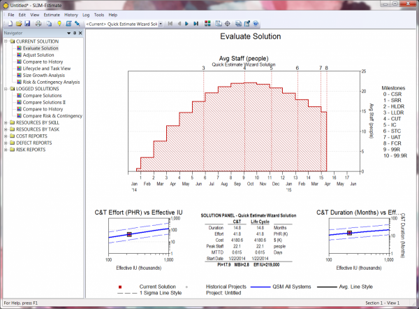
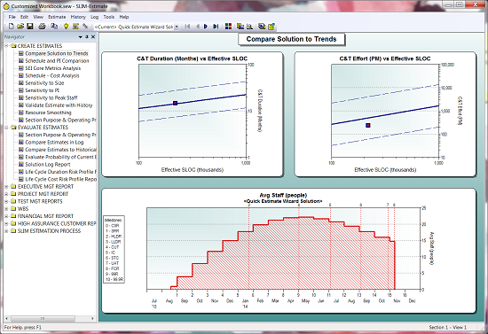
The new look and feel of the default workbooks in SLIM Suite are based around infographic and dashboard design principles.  Information Dashboard Design by Stephen Few served as an excellent resource for updating the views and color schemes in SLIM Suite 8.2.  Our goal in updating the look and feel of SLIM-Suite 8.2 was to highlight the pertinent inputs and outputs in bright, bold colors and to allow other view elements like gridlines or historic data to fade into the background by using more muted colors, allowing you to focus on the important metrics when making key management decisions. 

New views in SLIM-Estimate

New views in SLIM-Estimate

As you step through the default workbook in SLIM-Estimate, you'll notice that the default folders and view names have changed.  Views have been reorganized into folders with descriptive, functional names to make it easier to find the right views, charts, and reports and give users a more effective dashboard for evaluating solutions, adjusting them and reviewing logged solutions.

SLIM Suite 8.2 comes with four themes to choose from, plus two placeholders for your own custom themes.

White Background (Default)

White background

Blog Post Categories 
SLIM Suite Tips & Tricks

Customizing SLIM Suite Workbooks

Although each workbook is set up with default themes, the look and feel of SLIM-Estimate, SLIM-Control, SLIM-Metrics, and SLIM-MasterPlan workbooks are readily customizable.  

Default workbook settings

Screen Background

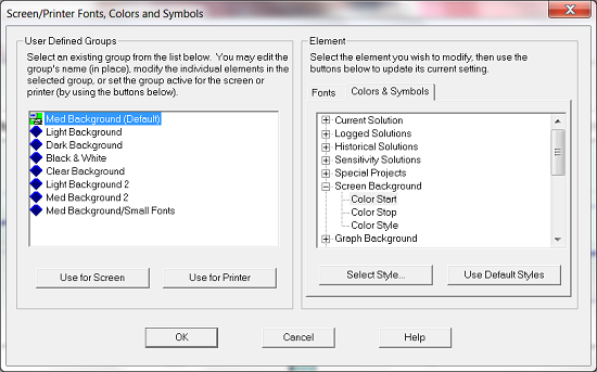
The easiest way to change the feel of your workbooks is to change the background color and style.  To change the background color, go to Tools|Customize Display|Screen/Printer Fonts, Colors, and Symbols…, then go to the Colors & Symbols tab on the right.

Screen/Printer Fonts, Colors, and Symbols

Color Start and Color End are important if you want to create a gradient background, like the background in the first image.  A gradient background begins with your specified Color Start color then transforms into your Color Stop color either vertically, horizontally, or diagonally (pictured above).  If you choose the Solid color style, simply select your Color Start.

Graph Background

Like the Screen Background, you can have a solid background or a gradient.  Simply follow the steps above for selecting your colors and styles.

Solutions and Reference Data

Database Validation Best Practices

Database validation is an important step in ensuring that you have quality data in your historical database.  I've talked before about the importance of collecting project data and what you can do with your own data, but it all hinges on having thoroughly vetted project history.

Although it's nice to have every tab in SLIM-DataManager filled out, we really only need three key pieces of information to calculate PI:

  • Size (Function Unit): if the function unit is not SLOC, a gearing factor should be provided (97.3% of projects in the database report total size)
  • Phase 3 duration or start and end dates (99.9% of projects in the database report phase 3 duration)
  • Phase 3 effort (99.9% of projects in the database report phase 3 effort)

These fields can be thought of as the desired minimum information needed, but even if one is missing, you may not want to delete the project from the database. A project that is missing effort data, for instance, will not have a PI but could be used to query a subset of projects for average duration by size. Likewise, a project with no size will not have a PI, but does contain effort and duration information that could be useful for calculating the average time to market for a division. However, if possible, it is a good idea to fill out at least these three fields.

Blog Post Categories 
SLIM-Metrics Data SLIM-DataManager Database

Updated Function Point Gearing Factor Table

Version 5.0 of the QSM's Function Point Gearing Factor table is live!

The Function Point Gearing Factor table provides average, median, minimum, and maximum gearing factors for recently completed function point projects. A gearing factor is the average number of basic work units in your chosen function unit. Originally, it was designed to be used as a common reference point for comparing different sizing metrics by mapping them to the smallest sizing unit common to all software projects. QSM recommends that organizations collect both code counts and final function point counts for completed software projects and use this data for estimates. Where there is no completed project data available for estimation, we provide customers with a starting point to help them choose an appropriate gearing factor for their chosen programming language.

For this version of the table, we looked at 2192 recently completed function point projects out of the 10,000+ in QSM's historical database. The sample included 126 different languages, 37 of which had enough data to be included in the table. Interestingly, this year we added three new languages: Brio, Cognos Impromptu Scripts, and Cross Systems Products (CSP).

One trend we noticed is that, in general, the range for gearing factors has decreased over time. Similarly, the average and median values have decreased, which we attribute to having more data to work with.

Read the full press release or visit the new table!

Blog Post Categories 
QSM News Function Points

What's the Story in Your Data?

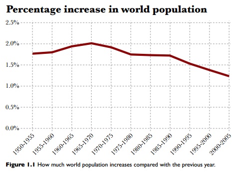
In his book, The Functional Art, Alberto Cairo sets out to explain what data visualizations are, why it is significant to pair data and design, and how to assess whether a data visualization is "good" or not.  In the first chapter, Cairo presents an example from Matt Ridley's book, The Rational Optimist: How Prosperity Evolves.  Ridley asserted that the global population was decreasing over time, using only one line chart.

Percentage Increase in World Population


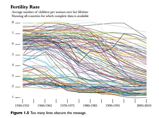
Cairo  was uncomfortable with that assertion, so he used the UN and World Bank data for fertility rates (the average number of children born to a women in each country) to create a graph that used individual country population data instead of using aggregate data.  The chart below shows all the fertility rates for every country over time.

Fertility Rate

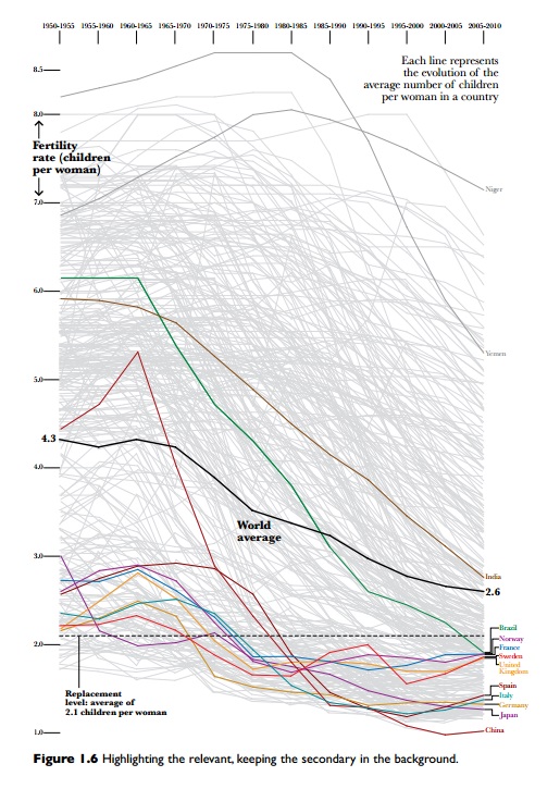
There are so many stories in the data that it's overwhelming, so Cairo created the following graphic which highlights just a few countries in order to pull out the story within the data:

Figure 1.6 Highlighting the relevant, keeping the secondary in the background

Blog Post Categories 
SLIM-Metrics Data

All About Bar Charts and Histograms

Having data is great, but if you don't understand how to display it, you can't get your point across.  The focus of this blog series is to explain the various chart types available to you in SLIM-Metrics so that you can efficiently analyze your data, as well as to provide helpful tips and tricks. 

Bar charts break a data set into bins or categories and provide the number/percent of projects or the average metric value for each category.

Unlike scatter plot charts, bar charts can display both numeric and text metrics. There are two metrics tabs on a bar chart property sheet — one for the independent and one for the dependent metric. To create a bar chart, highlight the independent and dependent metric you want to display and select Choose, or simply double-click the desired metric. Once chosen, the selected metric name appears in the field to the right of the Choose button. 

Histograms

Histogram

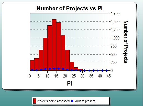
Histograms display continuous numeric data (each bar spans the interval between dependent axis ticks) grouped into evenly spaced bins on the independent axis, for the first data set. Additional data sets are overlaid over the bars in a line style with symbols. The Bin Size or Number of Bins can be customized, or you can select Auto to accept the default bin settings.

Histograms show both values and distributions, which is an important way of evaluating single summary statistics, such as averages.  For example, if a PI histogram follows a normal distribution, then you can probably use the average PI for estimation.  If a PI histogram does not follow a normal distribution, then it is a good idea to choose a different method to pick PI.

Blog Post Categories 
SLIM-Metrics Tips & Tricks

Effort: What's Behind that Number?

Effort seems like a metric that's very straightforward, but there is a lot of complexity here, particularly if you are performing benchmark analysis. Recently, I was tapped to help out with a benchmark assessment. One of the metrics that the customer wanted to analyze was effort per function point. "Effort" on its own is very vague, and while the customer might know which phases or activities his organization uses, I can't be sure that definition will match what I think he wants. In order to effectively benchmark, we need to make an apples-to-apples comparison by examining what is really behind the effort number, so it was necessary to send the client phase and activity definitions. 

Here are some helpful definitions to help you understand which activities are included in each phase: 

Concept DefinitionThe earliest phase in the software life cycle, where complete and consistent requirements and top-level, feasible plans for meeting them are developed.

The objectives of this phase are to develop a complete and technically feasible set of requirements for the system and to formulate the top-level approach and plan for their implementation.  Typical products of these activities include:

Blog Post Categories 
Benchmarking Effort

Data Myths

In a post for The Guardian's Datablog, Jonathan Grey explores the rise of data journalism. Data journalism is "a journalistic process based on analyzing and filtering large data sets for the purpose of creating a new story. Data-driven journalism deals with open data that is freely available online and analyzed with open source tools. 

Although data is a powerful tool, Grey reminds readers that it's not a silver bullet and counters some commonly held data myths. 

Data is not a perfect reflection of the world.

Blog Post Categories 
SLIM-Metrics Data SLIM-DataManager