Although the software industry is known for growth and change, one thing has remained constant: the struggle to reduce cost, improve time to market, increase quality and maintainability, and allocate resources most efficiently. In a world where everything is software, from the systems in your car to the thermostat in your home to the small computer in your pocket, we’ve continued to raise the bar on what we expect software to do for us. One way to combat growing challenges is by using practical measurement and metrics. When expectations for software projects are up in the clouds, empirical performance data can help bring them back down to earth. The best way to create realistic proposals and avoid costly overruns is to ground estimates firmly in actual performance data from similar projects.
To paraphrase Ferris Bueller, software moves pretty fast; if you don’t look around, you could miss it. QSM’s industry database spanning four decades can help us see where we’ve been and show us where we could go while keeping us grounded in data. In the QSM Software Almanac (2014 Research Edition), we took a high-level look at changes to software schedules, effort/cost, productivity, size, and reliability metrics from 1980 to 2014. Our latest study updates our previous research with over 2,000 new data points. An important note: as we update our database, we often get older project data in addition to more recently completed projects, which provides a rich pool of projects to analyze. Because of this, some previously reported trends may have changed.
Sample Demographics
Since 1978, QSM has used performance data and trends from our database of 13,000+ completed software projects to support benchmarks of completed projects and estimates of future work. Our basic metric set focuses on size, time, effort, productivity, and defects; but these core metrics are supplemented by nearly 300 additional quantitative and qualitative measures.
The QSM database captures software lifecycle metrics from the initial feasibility study period through post implementation maintenance activities. Project types range from Real Time to Telecommunications to System and IT applications. Like the IT Almanac, this paper focuses on a large and diverse sample of Business (IT) projects completed from January 1, 1980 to the present. Projects in the Business domain typically automate common business functions such as payroll, financial transactions, personnel, order entry, inventory management, materials handling, warranty and maintenance products. Frequently they rely on distributed architectures and transaction processing supported by telecommunications infrastructure (LANs) and database back ends.
Though our database captures the full software lifecycle, this study focuses on schedule and effort from the start of Requirements (analysis and design) through the end of Build & Test when the system is put into production. Effort figures include all skilled labor needed to produce a viable product (analysis, design, coding, integration, testing, certification, documentation, and management).
Our long-term trends sample contains:
- 10,000+ Business projects completed and put into production since 1980.
- Over 1.2 billion total source lines of code (SLOC).
- 9.9 million total function points.
- Over 120 million person hours of effort.
- 600+ programming languages.
Software projects can be classified in many ways: by country of origin, project type, technology (language), or industry. Projects in the QSM database hail from 5 continents with the majority developed in the United States, the United Kingdom, the Netherlands, India, Canada, and Japan. Projects with only one record (Bolivia, Costa Rica, Turkey, Trinidad and Tobago, Portugal, Puerto Rico, and Hong Kong) are not shown on the chart below:
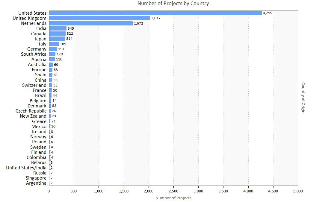
Figure 1. Projects by country of origin
Most projects in our IT sample were developed for the Financial, Utilities, Manufacturing, Government, and Transportation industries. Note that 14.7% of projects in our sample did not report an industry. Projects where the industry is unknown are not shown in the chart below. In many cases, IT systems differ more by function than by industry but for highly regulated industry sectors like finance, government, and health care, complying with government regulation and standards increases time to market and inflates cost.
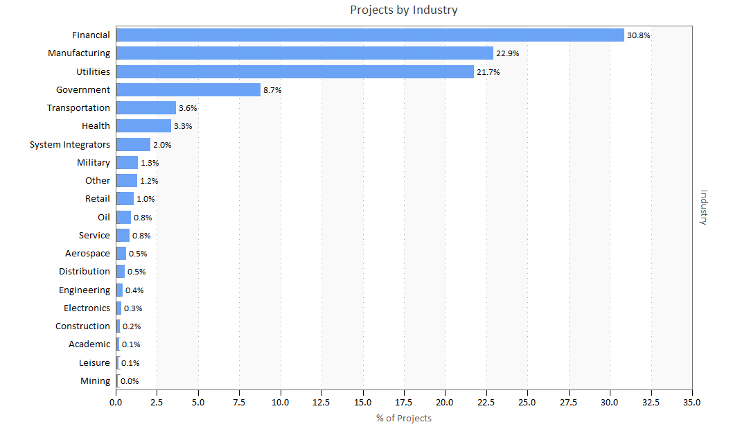
Figure 2. Percent of projects by industry
Stratifying the overall Business sample by functional detail promotes apples to apples comparisons between systems that solve similar problems and perform the same functions. The majority of projects in our sample were Financial Management, Billing, E-commerce/Web systems, Customer Care, Facilities Management, and Sales applications.
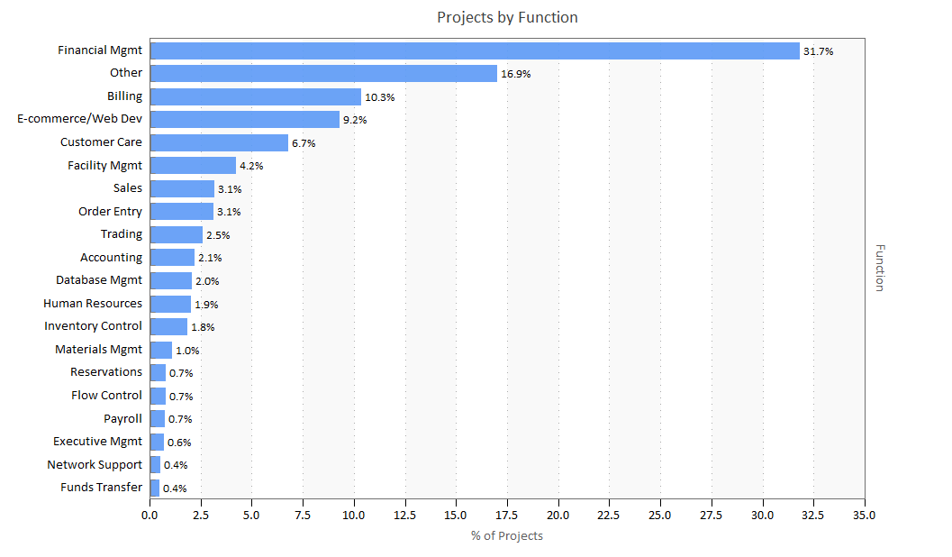
Figure 3. Projects by function
This chart shows how the number of projects collected during each ten-year period in our IT sample has increased over time. The growth of our database is a rough proxy for the increasing presence of software used to power everything from cars to computers to entertainment and communication devices.
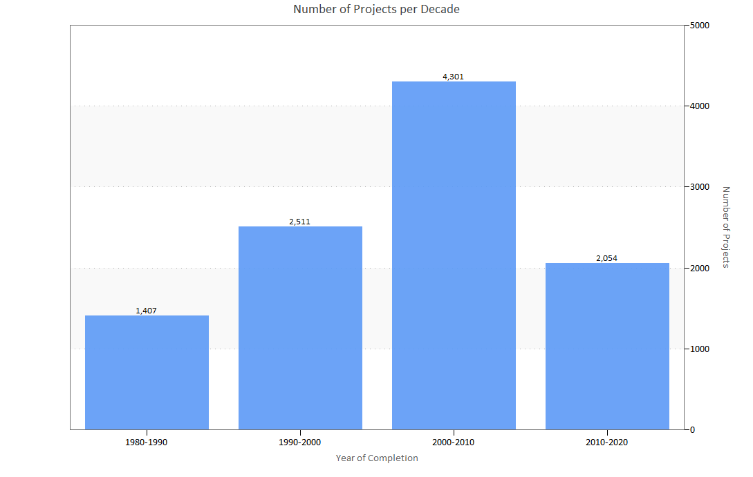
Figure 4. Projects per decade
The “Typical Project” Over Time
What does a typical project in the QSM database look like, and how has “what’s typical” changed over time? To find out, we segmented our IT sample by decade and looked at the average schedule, effort, team size, new and modified code delivered, productivity, language, and target industry for each decade. All projects in the sample include activities from the Requirements phase through the Build and Test phase.
During the 1980s, the typical software project in our database delivered 155% more new and modified code, took 120% longer, and used 72% more effort than today’s projects. The table below captures these changes:
|
|
1980-1989 |
1990-1999 |
2000-2009 |
2010-present |
|
Schedule (months) |
16.1 |
9.9 |
7.7 |
7.3 |
|
|
18,019 |
13,867 |
8,919 |
10,500 |
|
|
5.9 |
6.7 |
6.4 |
7.5 |
|
|
|
|
|
|
|
|
|
|
|
|
|
|
|
|
|
|
|
|
|
|
|
|
- Schedule: Project schedules have decreased dramatically from a high of 16 months in the 1980s to over 7 months after the year 2000.
- Effort: Average person hours per person month for Requirements through Build and Test started off high in the 1980s but decreased through the 2000s before increasing slightly from 2010 to the present. Overall, the trend is toward projects expending less effort in the Requirements through Build and Test phase.
- Size: From the 1980s to the present, average new and modified delivered code volume was reduced by about 60%. Later in this paper, we’ll explore this size reduction in more detail.
- Team size: Average team size has increased slightly by 1.6 FTE since the 1980s. We suspect the influence of project size reduction has been offset by increases to architectural and algorithmic complexity. While smaller systems generally require fewer developers, technical complexity tends to increase the demand for team members with specialized skills and diverse subject matter expertise.
- Primary Language: For projects put into production during the 80s and 90s, COBOL was the dominant programming language. In the 2000s, JAVA eclipsed COBOL and has continued to be the most frequently used primary language. People are often surprised at the enduring presence of COBOL, but the majority of recent COBOL projects in our database represent maintenance releases of existing systems rather than new developments.
Programming Languages Over Time
In 2014, we looked at the use of single vs. multiple languages. The chart below shows the relative proportion of projects developed in a single language to projects developed in multiple languages. In our latest research, we’re seeing a definite increase in single language projects starting in the 2000s. We suspect that development class (whether a project contains entirely new functionality or enhances an existing system) may be influencing the results below. Over the last several time periods, enhancements to older systems have increased relative to new developments. Enhancements to legacy systems written in a single language often use single languages as well.
Figure 5. Single language versus multiple language projects over time
The word cloud below shows the top 15 primary languages for projects completed after 2010. The most popular language (largest font) is JAVA (41%) with COBOL (8%) as a distant second. This proportion remains unchanged from our last study in 2014.

Figure 6. Word cloud displaying the top 15 most popular programming languages for projects in the QSM database completed since 2010
Delivered Code Volume (Size) Over Time
In the 2006 IT Almanac, we looked at how the average size (measured in new and modified code) of software projects had changed from approximately 85,000 new and modified SLOC in the early 1980s to about 28,000 by the early 2000s.
While the average is a useful measure of central tendency, it can be influenced by very large or very small values in the sample. The median (or “middle” value, with half of the data above and below it) size values shown in Figure 7 demonstrate the trend toward smaller projects even more clearly. In the early 1980s, the median new and modified code delivered was four times larger than median project sizes for systems completed after 2000. The latest data also indicates that the long term trend towards smaller, more compact projects may be starting to stall; sizes for projects completed after 2000 have remained very close to projects in the most recent time bucket. We will watch this carefully as we add more data to our database.
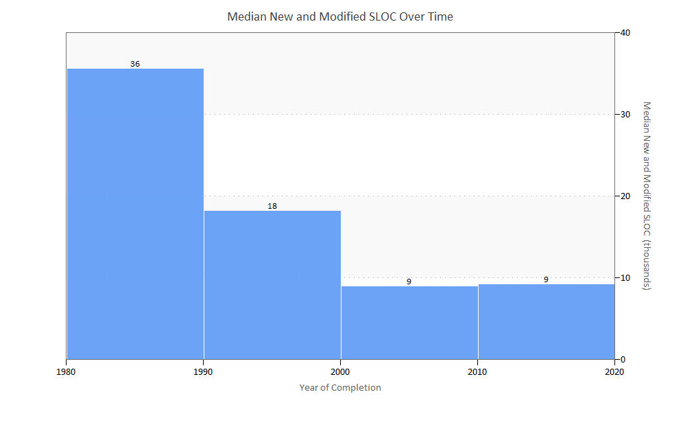
Figure 7. Median new and modified source lines of code over time
Why Are Projects “Shrinking” Over Time?
On average, today’s developers deliver about 40% as much new and modified code per project as they did 40 years ago. What is driving the steep and sustained decline in delivered code volume? This size reduction most likely reflects a combination of factors:
- There is more unmodified code. Whether it takes the form of open source code, frameworks, reused/legacy code from existing applications, or generated code, reuse comprises an increasing portion of delivered applications. Since the chart in Figure 7 reflects only new and modified code delivered during each time period, reuse is not reflected. We’ll examine unmodified code in more detail in the Code Reuse Over Time section.
- More efficient and powerful programming languages and methods. As technologies and development environments continue to evolve, each line of code delivers more “bang for the buck” per line of code in terms of functionality.
- New lifecycle methodologies like Agile, RUP, and incremental builds attempt to manage scope creep by allotting smaller groups of features to predefined time boxes, sprints, or iterations.
- Measurement inefficiency. Well established and defined sizing techniques like function points require trained practitioners and can be expensive to count, and they don’t always capture all the work required to deliver the product. Organizations like IFPUG are developing techniques like SNAP to account for this kind of nonfunctional work. Early, design-based size measures like requirements, stories, and use cases may be defined at too high a level to fully capture scope creep as the design evolves. While it would be premature to read too much into this reduction in the long term trend to smaller delivered code volume, it’s possible that we’re seeing the first signs of a practical limit on size reduction.
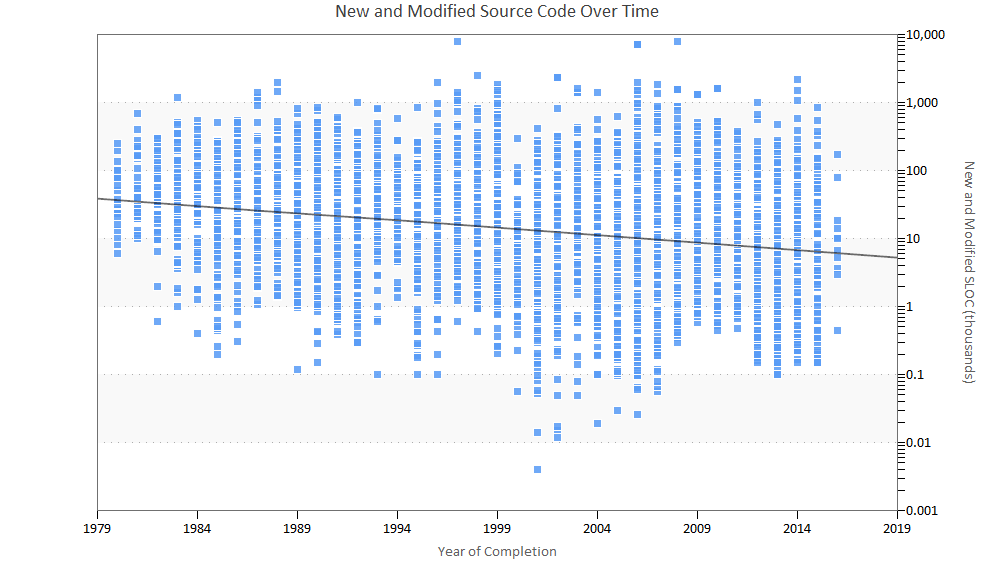
Figure 8. New and modified source lines of code over time
The scatter plot above provides another view of how average delivered project size has decreased over time. The grey trend line tracks average system size over the last four decades. In the QSM Research Almanac (2014 IT Edition), we reported that the range of system sizes observed seemed to be increasing, with the greatest variability occurring from 2000 to 2006.
Code Reuse Over Time
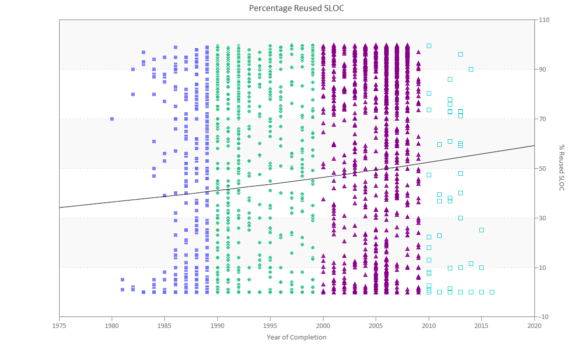
Figure 9. Percentage of reused source lines of code over time
In the chart above, we divided our sample into ten-year time buckets. The solid grey line represents the average percentage of reused (unmodified) code over time. In the 2014 study, we reported that the percentage of reused code had declined steadily, from an average of about 50% reused code for the 1980s, to about 45% reused code in the 1990s, to about 35% in the 2000s.
As we add newly completed projects to our database, we often get older projects as well. This older data sometimes causes us to revisit or revise previous observations. In our most recent research, the percentage of reused code has steadily increased, from about 40% in the 1980s to about 50% in the 2000s.
Development Class Over Time
Of the 10,000+ projects in our long term trends sample, about 58% provided development class information. Development classification describes the type of development effort undertaken by the project:
- New Development: 75% of the system is new functionality
- Major Enhancement: 25 to 75% of the system is new functionality
- Minor Enhancement: 5 to 25% of the system is new functionality
- Conversion: < 5% of the system is new functionality
- Maintenance
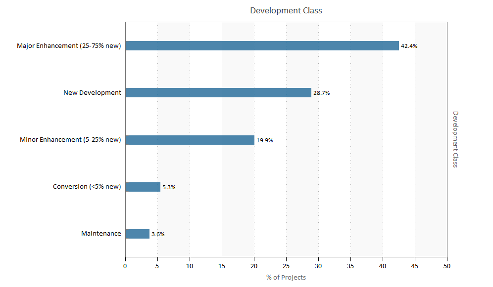
Figure 10. Percentage of projects in each development class
About two thirds (62%) of the projects in our sample were Major or Minor Enhancements of existing systems. Under one third of the projects were New Developments.
Figure 11. Development class distribution over time
The bar chart above shows how the proportion of projects for each development class has changed over the last two decades:
- New developments have decreased by almost half since the 1990s (data was not available for earlier time periods).
- Major Enhancements nearly doubled by the 2000s and have continued to increase.
- Minor Enhancements have held steady at about 18% over the last three decades.
- Conversions and Maintenance projects have also remained fairly constant over time.
- In the early 1990s, enhancements to existing systems (major and minor enhancements combined) were roughly equal to new development. By the latest decade, enhancements outpaced new developments by a factor of three.
Project Schedule Over Time
In the early 1980s, the average software project took over a year to develop. Since the mid-90s, software development has stayed within the 7- to 8-month range. Median schedules show the same downward trend.
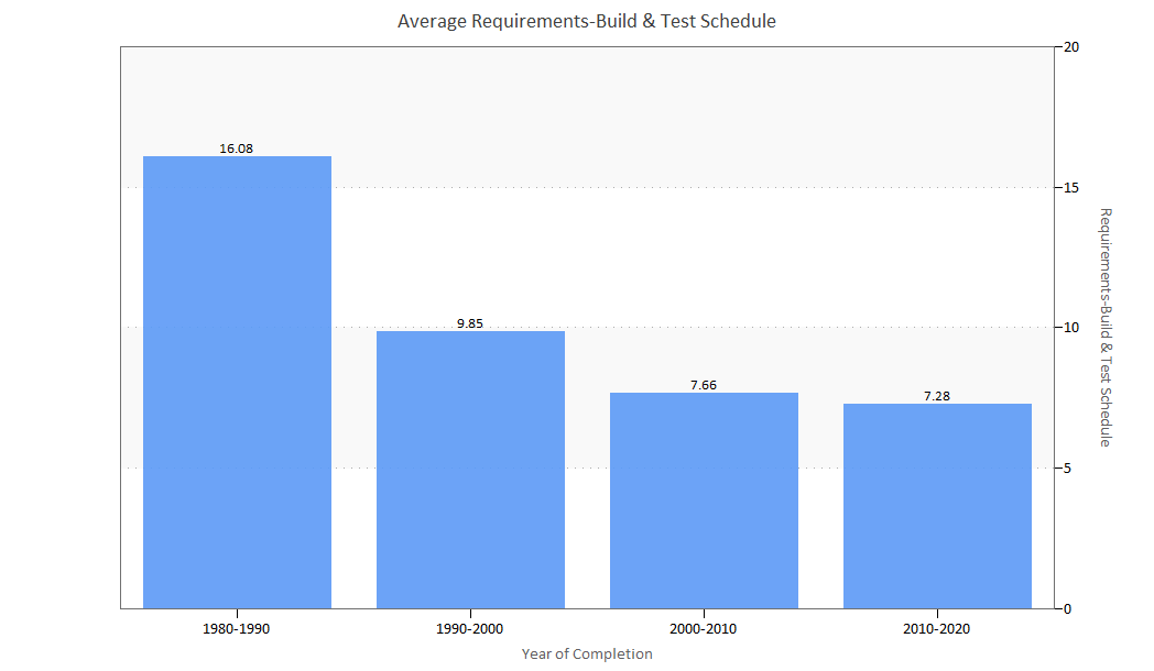
Figure 12. Average Requirements-Build & Test schedule over time
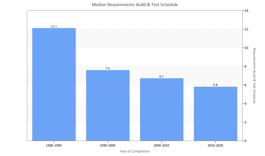
Figure 13. Median Requirements-Build & Test schedule over time
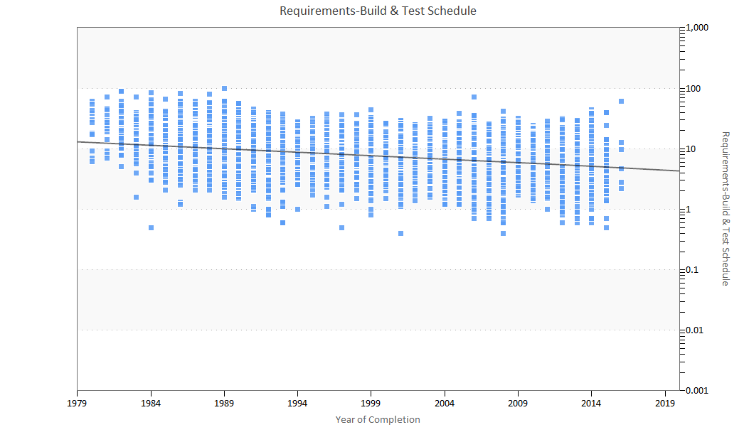
Figure 14. Requirements-Build & Test schedule over time
The individual data points shown in the scatter plot above provide additional insight into the range of schedule outcomes. In the QSM Research Almanac (2014 IT Edition), we reported that the portion of the graph from 2009 on showed less variability in project schedules than in the preceding years. This may reflect a corresponding decrease in size variation observed during the same time period earlier in this paper, or it may reflect the increasing influence of time boxing methods used with by Agile and other iterative development methods. In our new research, the portion of the graph for 2012 shows more variation than in the years preceding and following it. While project schedule maximums have stayed in the same range, we’ve seen shorter projects in this time period and, in fact, more projects with very short project durations than the rest of the sample.
Effort Performance Over Time
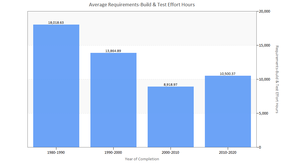
Figure 15. Average Requirements-Build & Test effort hours over time
The bar chart above shows average Requirements through Build and Test effort for ten-year time buckets. Effort expenditure is a function of staffing strategy (team size), productivity, and schedule. Projects in the 1980s took almost twice as long as projects in the most recent time bucket. Over the same time period, project sizes have decreased by nearly two thirds and schedules by half. As we saw in our Typical Project section, team sizes have increased slowly but steadily over time.
Why has effort reduction not kept pace with declines in average size and schedule? Application complexity (both algorithmic and architectural) may require more diverse skill sets and thus, larger teams. More advanced and rigorous methods and practices may allow teams to work together more effectively. Finally, it may simply be that companies trying to meet aggressive time to market goals may be using larger teams than needed in the hopes of reducing the schedule.
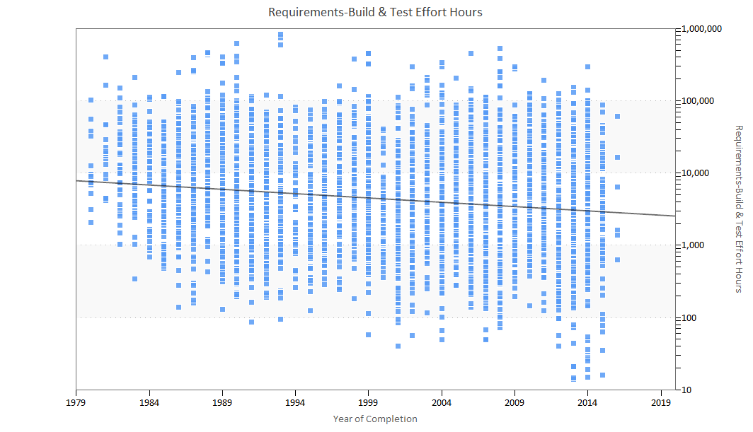
Figure 16. Requirements-Build & Test effort hours over time
The scatter plot of individual projects shown above reflects the overall trend toward lower effort expenditure. The average project in the early 1980s took about 18,000 person hours to complete, whereas the average project in the 2010s used 10,500 person hours. As we noted in the Typical Project section, average team size has increased slowly but steadily in recent years. Smaller projects with dramatically shorter schedules but only slightly larger team sizes end up using less effort on average.
Development Productivity Over Time
QSM’s Productivity Index is a measure of the total development environment. It embraces many factors in software development, including management influence, development methods, tools, techniques, skill and experience of the development team, computer availability, and application complexity. Values from .1 to 40 are adequate to describe the full range of projects. Low values are generally associated with poor environments and tools and complex systems. High values are associated with good environments, tools, and management, and well-understood, straightforward projects.
A little known but major productivity driver is application size. As size increases, so does average PI, and vice versa. This is true regardless of the measure used; ratio-based productivity measures like SLOC or Function Points per effort unit exhibit the same relationship to project size as QSM’s Productivity Index (which reflects not only size and effort, but time to market as well).
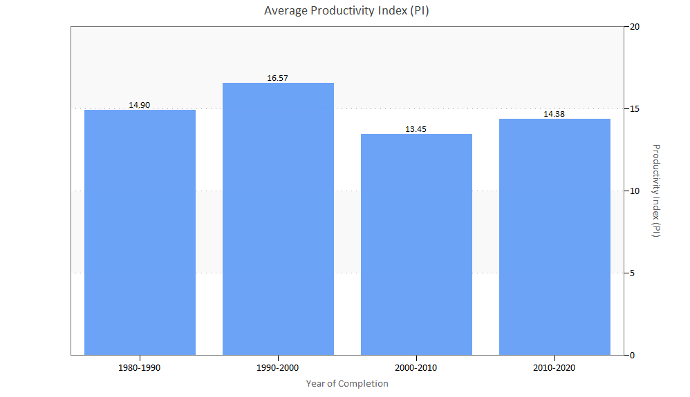
Figure 17. Average Productivity Index (PI) over time
The bar chart above shows that productivity peaked in the 1990-2000 time bucket and has decreased since then. We noted in the 2006 QSM Almanac that productivity in the 1995-2000 time bucket seemed artificially high due to Y2K projects that contained less original design work or new algorithms. We also noticed that projects in the 2000-2005 time period had a lower average productivity than projects in the 1990s. There’s been a slight increase in PI in the last decade, but not a return to the values in the 1995-2000 time bucket.
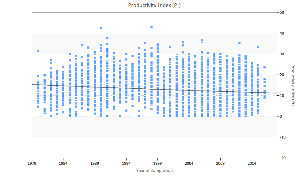
Figure 18. Productivity Index (PI) over time
The scatter plot above shows productivity for individual projects in the sample over time. Note the increase in very low PIs starting around the year 2000 and continuing to the present. This may reflect the dramatic decline in project sizes (on average, productivity increases with project size) or possibly growing numbers of enhancement projects relative to new development.
Conclusions
In reviewing changes to project size, schedule, effort, and productivity over the past three decades, we thought it would be interesting to look back to the conclusions of our 2006 and 2014 IT Almanac studies to see how well our predictions and observations have held up.
Size
2006: From the early 1980s to 1997, the average size of software projects was cut by more than half. The reduction in median project size was even more dramatic: more than a 75% reduction in developed size. Developers are writing less new and modified code per release. We attribute this to more powerful languages and higher degrees of reuse.
2014: We are still seeing a trend toward smaller projects. In fact, the median new and modified code delivered in the early 1980s is four times larger than the median for projects completed after 2000. We think that projects are smaller due to new lifecycle methodologies, such as Agile, which promote allocating smaller groups of features to a predefined time box, sprint, or iteration. We also think that programming languages are becoming more powerful, which allows each line of code to create more functionality.
2019: The trend toward smaller projects has continued. In the early 1980s, the median new and modified code delivered was 74% larger than median project sizes for systems completed after 2015. We think this is because Agile has become a more mainstream development methodology, but we’ll be interested to see how size changes in the future.
Reuse
2006: Average reuse for the industry as a whole peaked at 65% in the mid-nineties and then declined to 50% in the early 2000s. Our research suggests that 60-70% reuse appears to be the practical upper limit for the average project portfolio. It appears to be easier for most projects to affect reuse on the small and large ends of the scale; i.e., when unmodified code is under 20% or over 70%.
Code reuse has complexity and productivity implications. Developers don’t get “credit” for unmodified code, which must still be tested and integrated with new and modified code. Reused code definitely has an impact on the project schedule and effort profile and on project productivity as well. It appears that reuse, along with the advent of complex n-tier client server applications and object-oriented programming, must be considered as another complexity factor which impacts productivity.
2014: The percentage of reused code has continued to decline to about 35% for projects completed between 2005-2010. Integrating existing frameworks and legacy code with newly written code is a significant complexity factor that can have dramatically different effects on project productivity.
2019: Code reuse has increased, from about 40% in the 1980s to about 50% in the 2000s. This is perhaps linked to changes in development class. In the 2000s and 2010s, Major and Minor Enhancements represent about 50% of all projects in our IT sample.
Productivity
2006: Both average and median PI declined precipitously in 1997 with the average falling from 17.67 to 13.01 in a seven-year period. We can only postulate that the relatively greater ‘startup’ inefficiencies inherent in smaller projects, increased complexity, reuse, and possibly measurement inefficiency inherent in abstract size measures may play into this decline. It may well be that we need to re-baseline our thinking on productivity to encompass the realization that with new 4th generation languages, each line of “code” is doing far more work than a line of code did in the past. We are, in effect, getting more bang for the buck, even if it doesn’t always show up in the numbers.
2014: In the most recent time buckets, we’re seeing a continuation of the trend toward smaller PIs, although the decline is very slight (about half a PI). We also saw an increase in very low PIs starting around the year 2000. This might reflect the dramatic decline in project sizes (productivity increases with project size) or possibly growing numbers of enhancement projects relative to new development.
2019: We’re still seeing a trend toward smaller PIs, although we’ve noticed a slight uptick in PIs in the past few years. A major driver of productivity is size; as size decreases, so does PI. The recent modest increase in average PIs suggests that keeping project sizes manageable allows developers to use slightly larger teams to achieve better time to market.
Language
2006: Programming language does not appear to be a strong influence on overall project productivity, but it may simply be that other factors are more important or that we cannot isolate the effects of language. Many projects these days are developed in multiple languages, making it difficult to gauge the effect of a single one. COBOL, Java, and Visual Basic remained the most popular development languages in 2004, as they did in 2001.
2014: We expected to find increasing numbers of projects using multiple vs. single languages, but here the data surprised us. We suspect that the growing prevalence of enhancements to older systems (as opposed to new development) may be inflating the proportion of single language projects that come into the database.
2019: In the 2010s, 60% of projects were developed using a single language, which we believe is still related to the fact that most projects developed in the last decade have been enhancements.
Our previous studies showed steady improvement in most IT effectiveness measures over time. Projects have continued to become more compact, expend fewer resources, and take less time to complete even as they grow more complex and the teams building them more diverse and distributed. Is there some natural limit, beyond which further attempts to reduce the size, effort, and schedules of what we call a project become counterproductive? We’re looking forward to seeing how these trends change (or stay the same) as we get more data.
