From time to time, questions from clients get us thinking:
After yesterday's Web presentation on the QSM Benchmarking Consortium, I went to your Web site and found the paper "Performance Benchmark Tables." I noticed the delivery rates in both SLOC/PM and FP/PM numbers increase as average project size increases. This seems counterintuitive: are the Performance Benchmark Tables correct?
That's a great question. Our data definitely shows an upward trend in productivity as application size increases. This is true whether we use measures like QSM's PI (productivity index) or ratio based productivity measures (SLOC or FP per person month of effort). The QSM industry benchmark trends behave similarly: as projects get larger, average productivity increases as well.
Paul Below recently took another look at productivity data using several popular statistical software packages. The question he was trying to answer was, “Does productivity (measured as SLOC/PM) always increase with system size, or could the size-productivity relationship actually behave differently in certain regions of the size spectrum?" To answer this question he used something called residuals to evaluate the size/productivity regression trend.
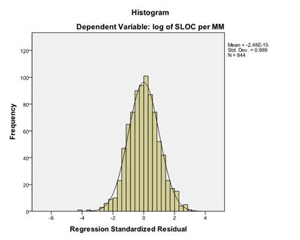
Simply put, residuals measure the difference between predicted values (the value of the regression trend at a particular size) and actual metric values. If the regression line provides a poor “fit” in certain size regimes, the residual values will reflect the gap between the values predicted by the trend and actual productivity values for that size regime. What he found was encouraging. The residuals formed an almost perfect normal distribution:

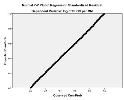
This implies that there was no unexplained skew in the data that is not accounted for by the regression curve. A second plot of the expected against actual cumulative probability confirmed these results:

If the regression line were distorted by outliers in the data, the discrepancies would show up as a curved region on the graph. A decline in the productivity of larger projects, for instance, would show up as a curve on the right side of the graphed line. But the line is straight, again indicating that there is no systematic error at the large end of the size spectrum.
No matter how we look at productivity, the data and the regression trends tell us the same thing: on average, team productivity increases with project size. In the next two posts, we’ll explore possible reasons for this behavior.
