What would sports be without performance statistics? They are the lifeblood of the decision-making process every day. Individual athlete and team rankings, salaries, college drafts and trades, and now sports gambling.

If you are using software development metrics to assess performance and guide process improvement initiatives, great! Including software size metrics provides the context and insight you need to establish a level playing field.
We have covered many of the benefits, concepts, and how-tos of software size measurement throughout our Software Size Matters video series. In this episode, we conclude our series by showing you why software size metrics are critical to performance benchmarking and estimate validation.
What Is Software Project Performance Benchmarking?
What is benchmarking? To benchmark is to evaluate or check something by comparison with a standard. A classic example of a sports standard for comparison is Batting Average in baseball, where 0.300 (30%) is a benchmark for elite hitting, allowing quick comparison of hitters. Benchmarking is the process of measuring products, services, and processes against those of organizations recognized as leaders in one or more aspects of their operations. It provides answers to important questions, such as:
- How do you compare with your competition?
- Are your investments paying off?
- Are you efficiently producing high-quality products?
It provides the necessary insights needed to identify opportunities for improvement as well.
Let's talk about software project benchmarking and the important role that software size metrics play. In Episode 2, Why Quantify Software Size, we said that once we add size to the major management metrics, namely duration, effort, productivity, and defects, predictable and robust patterns emerge as software size increases along the x-axis, left to right, the average value of every major management metric goes up. But these relationships are not linear. That means simple rules of thumb can't be used to model complex behavior. Variation at each size is greater for metrics like effort and defects, which are often influenced by management strategy or time pressure, than for metrics like schedule.
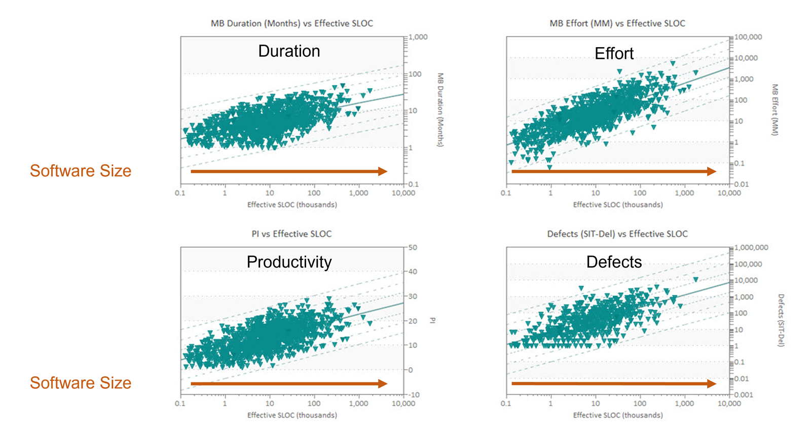
Knowing the average values for schedule, effort, defects, and productivity at various software project sizes helps organizations:
- Evaluate the realism of vendor bids,
- Estimate and plan new projects,
- Identify unrealistic productivity assumptions, and
- Compare project plans against industry data or their own demonstrated performance.
QSM uses scatterplots to analyze the QSM Industry Database of over 14,500 completed software projects and create the trends used in our SLIM-Suite® of software lifecycle management tools. Regression analysis is a statistical model that describes, estimates, predicts, and controls outcomes by modeling relationships between variables. This helps to understand how one or more independent variables, predictors, influence one or more dependent variables, outcomes. Software project reference trends are created using scatter plots with size on the x-axis and each of the core metrics on the y-axis. When working with industry data or your completed project data, queries are performed to create data sets that isolate common software project characteristics known to influence outcomes such as application type, industry, development methods, and more. Deviations from average values are used to determine performance benchmark ratings. Don't assume that project characteristics have an impact. Let the data tell you!
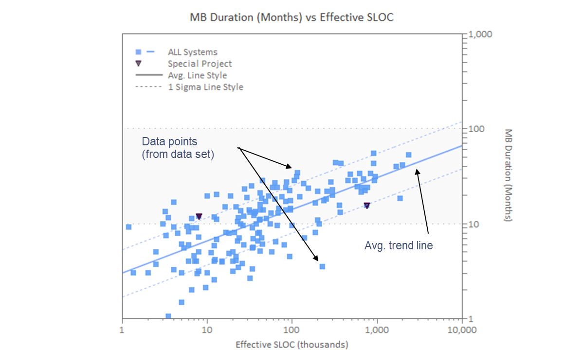
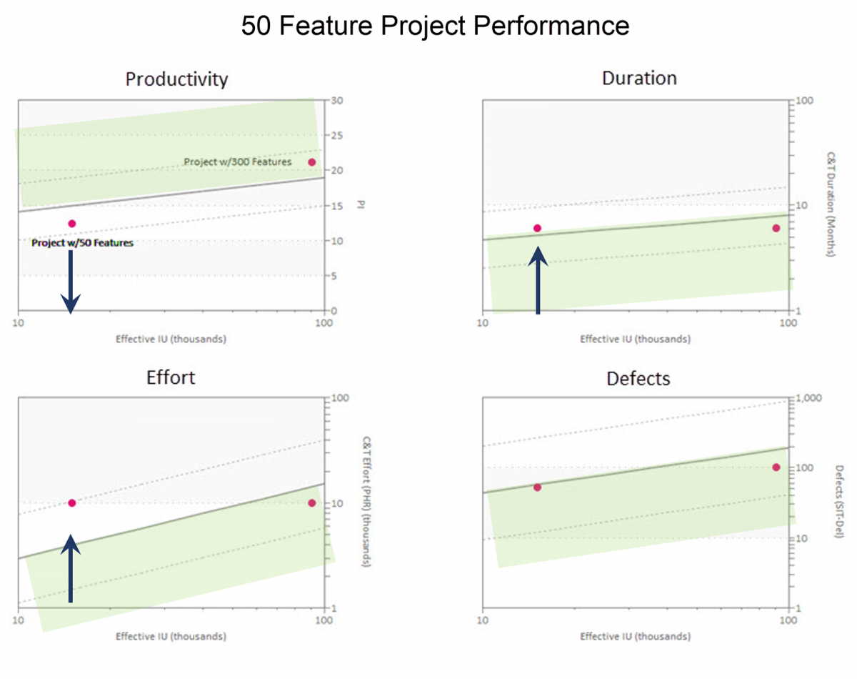
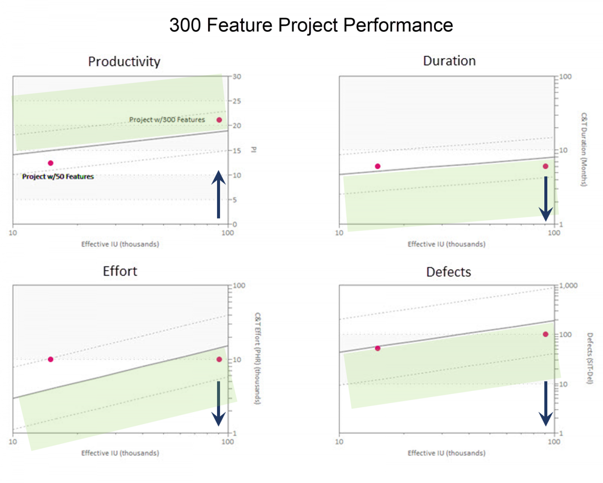
Taking project size into account supports estimate validation and post-delivery benchmarking by enabling meaningful project comparisons and providing context. The shaded regions on these scatter plots indicate more efficiency. Comparing two software projects against industry trend data, one delivering 50 features and the other delivering 300 features, we can see that:
- The 50 feature project used more effort and took more time than industry averages for a project of the same size. Because both time and effort were above the industry average, productivity was lower than average. Now, let's look at the 300 feature project.
- The 300 feature software development project used less effort and took less time than the average. It used less effort and delivered in less time than the industry average for a project of the same size. Result − productivity was higher than average, and defects were lower.
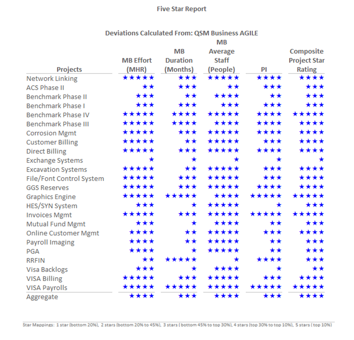
Benchmarking software development performance, particularly productivity, and reporting results to various audiences can be a challenge. Project managers often want detailed charts and reports, while senior management may just want the big picture. SLIM-Metric’s 5 Star charts and reports offer options for both audiences. Using 5 Star reports, you can benchmark groups of projects against a relevant data set or against industry and internal benchmark trends. The real power of the 5 Star report is that it takes the relationship between the core software metrics and project size into account, making it easy for even the busiest manager to interpret.
How to Know if Your Software Estimates Are Achievable
Software development organizations around the world use a variety of estimation techniques. How do you know if your estimates are good or if your assumptions about the schedule, staff level, or cost are reasonable? The ability to sanity check your estimates and vendor bids against historical trends helps you spot unrealistic expectations and negotiate achievable project outcomes.
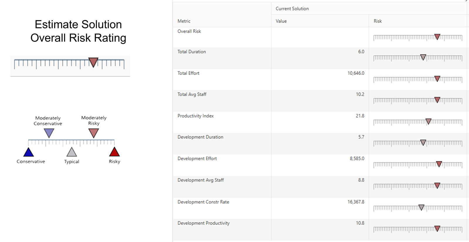
Calculating the deviation of estimated values from the trend averages lets you identify potentially risky scenarios. This risk rating chart shows several software project estimate values along with an indication of the risk of each value due to trend variance. Deviations from the trend have been translated into risk zones:
- Blue shaded region, conservative and moderately conservative,
- White around the average trend line, typical
- Red moderately risky and risky.
Conservative implies risk buffer − taking longer than average, assuming lower productivity than average, or using more people than average. Risky implies overly optimistic goals − shorter than average duration, assuming higher productivity than average or using less people than average.
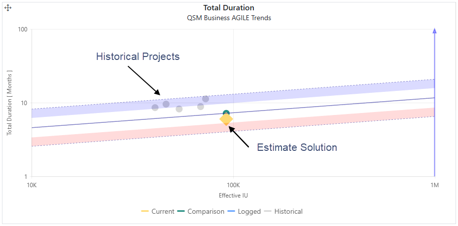
Assessments of risk or conservatism depend on the metric. The trend chart below shows Total Duration versus Effective IU (Software Size) with a blue line on the right y-axis with the arrow pointing up to indicate that taking more time to complete the project is a conservative approach. Risky project scenarios are those that propose a delivery schedule that is much shorter than average for projects of the same size and type. The current software project estimate in this example, represented by the yellow diamond, has a total duration slightly shorter than average, but within the zone considered typical, and thus is considered reasonable compared to industry trends. The ability to add historical data for just a handful of projects shows that the estimated duration is much shorter than this organization has achieved for similar projects, making it an unrealistic expectation for them. Conversely, a red arrow on the y-axis indicates that an estimated value on the high side is riskier than average, in the case of productivity.
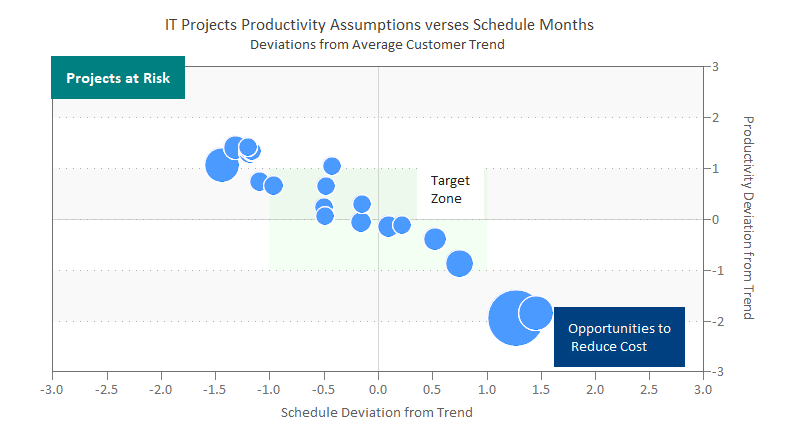
Quadrant charts make it easy to visualize potentially risky software projects by showing trend variations for two core metrics. In this example, the y-axis shows the average trend line +/- 3 standard deviations, with the same data range for the project schedule on the x-axis. The bubble metric is cost. Projects that position in the upper left quadrant are at risk because they propose productivity values much higher and schedules much lower than average. Likewise, projects that position in the lower right quadrant are overly conservative, proposing longer schedules and lower productivity values. The fact that this analysis is based on the customer's trends rather than industry trends emphasizes the need to investigate opportunities to negotiate estimates based on proven capabilities.
To summarize:
- Performance statistics enable data-driven decision-making.
- Software performance benchmarks show competitive position and guide improvement initiatives.
- Software Size must be included in performance benchmarks to ensure valid comparisons.
- Benchmark trends are used to sanity check estimates and negotiate successful outcomes with vendors and internal teams.
This blog post shows how quantifying software size provides the necessary context for truly meaningful software performance benchmarking and software estimate validation. We would love to hear how you are using software size metrics throughout the project lifecycle.
